Introducing the exercise:
The starting point for the exercise is to draw a total variable cost curve (VC). We explain that students
should simply assume that its shape is correct for the moment, but the VC curve will be derived at the end of
the exercise. We have shown a VC curve in Figure I to make this reading easier to follow. You could also
add that if students accept short-run (a good time to review the concept) VC as drawn, all the other cost
curves and their shapes follow logically given their definitions and the rules of geometry.
The cost relationships:
Teachers might like to begin by reviewing the definitions of the various cost concepts, but the important
point is that the class is aware of the following relationships. We have set these out using the familiar
symbols for brevity. Note that some texts use VC, while others may use TVC for total variable cost, etc.
TC = VC + FC
This is all that is needed for the total relationships and now you could continue to revise by adding FC to
Figure I and deriving TC as the line obtained by shifting the VC curve upwards by the amount of FC. The
average and marginal relationships (where A stands for average and M for marginal) for this review exercise
are:

Figure I
For this last relationship, since TC is parallel above VC, the slopes of both curves are the same at each level
of output.
Two simple rules:
These are:
a) If we take a point on a total curve (in this case associated with a quantity of output) and connect it to
the origin with a straight line, the slope of the line measures average.
b) If we draw a tangent to a total curve (at some quantity) the slope of the tangent measures marginal. In the first instance, if VC is 800 at an output of 100, AVC is 8. This would be the gradient of the straight line connected to the origin. In the second instance, the tangent to the total curve measures the incremental
change in variable cost associated with a small change in output.
The rules and the shape of the curves:
We illustrate briefly with the VC curve in Figure I, above. A good long straight edge and a ruler are useful in
class and can save you drawing a lot of lines. Starting with the second rule, you can show that MC declines
initially because the slopes of successive tangents to VC decrease as more output is produced. This continues until an output corresponding to point A on your VC is reached. This is minimum MC (we don’t know if you mention points of inflection) and MC then increases beyond this output.
For the second rule, the slope of successive straight lines connecting points on the VC curve to the origin will decrease until an output corresponding to point B is reached. This is minimum AVC, and the continued
application of this rule shows that AVC increases beyond this output. You might want to take some time
explaining the significance of point B. Here the two rules coincide (figuratively speaking) in that the slope of
the tangent to the curve is equal to the slope of a straight line connecting B to the origin of the diagram.
Hence MC is equal to AVC and can be shown to cut AVC at its minimum point. This is a good time to
sketch the AVC and MC curves and locate points like A and B.
From here, if you have added FC and TC to your original graph, it is a simple matter to use the first rule to
show that AFC continues to decline as more output is produced and then to repeat the process you used on
VC with your TC curve. Again it is worth spending time with the point (i.e. where the two rules coincide) on
TC that corresponds to B on your VC. We again have MC cutting ATC (in this instance) at its minimum
point, but this occurs at a higher output level than at point B. You could now add ATC and AFC to AVC and MC in your other illustration.
Explaining the original shape of VC:
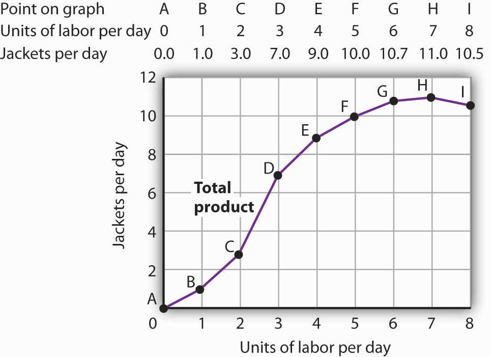
The last step is to show graphically that the shape of the variable cost curve comes from the law of diminishing returns as it relates to the total product curve. You have probably already given an example to
show that as successive units of a variable factor are added to the production process, total product first
increases at an increasing rate and then the law of diminishing returns sets in. The object here is to draw a
total product (TP) curve and then relate it to the total variable cost curve. The TP in Figure II shows
increasing and diminishing marginal returns. You might now ask the students, given labour (L) as the only
variable factor (an historical short-run assumption), what are the components of VC? Students will realize
that it is the wage rate (w) times the number of workers (the variable factor, L) employed.
Viewing Figures I and II, we have three variables; Q, VC and L. Q is present in both Figures and if VC can
be reconciled with L, the curves can be compared. We can do this remembering the VC = (L x w) and then
assuming that w is equal to one.
Given the assumption that the wage rate equals $1 per time period (to dispense with scaling problems), we
then rotate Figure II counterclockwise to line up against Figure I in the northwest quadrant. This is illustrated
in Figure III, and it is easy for students to see the relationship between the VC curve and the TP curve. If you really want to go into detail, you could use an example for the law of diminishing returns and relate it to the points of inflection in your two curves.
 Comment:
One of the advantages of this summary exercise is that there are many ways that it can be run (depending on
the size and ability of your class). The writer has predominantly used the lecture mode, but has also used
other methods in tutorials. You could get class members up to the board, let them work in groups to see what they come up with after you have explained the rules, etc., etc. We would welcome further suggestions and ideas in this regard.
c) Exercises
i) Probably the best type of exercise to cement the cost relationships is to get students to work through a tabular exercise. Here is a starter, and it is easy to add rows - incorporating your own tricks.
ii) In terms of the visual relationships, you could get students to reverse the axes of the TP curve to see what
shape they get; show how a scale change in the northwest quadrant of Figure II need not affect the shape of
the graph; and/or draw one of the curves on paper and reverse it (hold it up to the light?) to work on the
mirror image concept.
iii) We know from our sessions with secondary school teachers at Massey, that some of you get your
students involved with businesses in the local community. You might get groups to do surveys on the cost
structures of businesses directly engaged in production. Also are the businesses multiproduct firms? What
are the products? One issue to concentrate on would be what management views as fixed and variable costs
and the timeframe in which they feel that all costs become variable. The purpose of this exercise is to give
your students a feel for how economic theory stacks up to actual experience.
d) Conclusion
A good concluding point is to emphasize that one reason economists make the short-run distinction between
fixed and variable inputs is that this is about the simplest production function that we can come up with. It
illustrates “ceteris paribus”, the effect of a change in something when other things are held constant. Most
economists would also argue that it is still useful for making predictions when used in the theory of the firm.
As some of your students move on in economics, they will be exposed to more complex production
situations that are more realistic.
Lastly, you might mention the importance of understanding the average and marginal cost relationships since
they are crucial to an understanding of the theory of the firm. An explanation of competition, monopoly and
imperfect competition simply requires the same cost curves that we derived above, then the specific demand
characteristics of each firm type are graphed on to them and the profit maximizing rule is applied. In other
words, never forget the shapes (especially) of the ATC, AVC and MC curves.
Figure I and deriving TC as the line obtained by shifting the VC curve upwards by the amount of FC. The
average and marginal relationships (where A stands for average and M for marginal) for this review exercise
are:
ATC = TC / Q
= VC / Q + FC / Q
= AVC + AFC
MC = DTC / DQ = DVC / DQ
Figure I
For this last relationship, since TC is parallel above VC, the slopes of both curves are the same at each level
of output.
Two simple rules:
These are:
a) If we take a point on a total curve (in this case associated with a quantity of output) and connect it to
the origin with a straight line, the slope of the line measures average.
b) If we draw a tangent to a total curve (at some quantity) the slope of the tangent measures marginal. In the first instance, if VC is 800 at an output of 100, AVC is 8. This would be the gradient of the straight line connected to the origin. In the second instance, the tangent to the total curve measures the incremental
change in variable cost associated with a small change in output.
The rules and the shape of the curves:
We illustrate briefly with the VC curve in Figure I, above. A good long straight edge and a ruler are useful in
class and can save you drawing a lot of lines. Starting with the second rule, you can show that MC declines
initially because the slopes of successive tangents to VC decrease as more output is produced. This continues until an output corresponding to point A on your VC is reached. This is minimum MC (we don’t know if you mention points of inflection) and MC then increases beyond this output.
For the second rule, the slope of successive straight lines connecting points on the VC curve to the origin will decrease until an output corresponding to point B is reached. This is minimum AVC, and the continued
application of this rule shows that AVC increases beyond this output. You might want to take some time
explaining the significance of point B. Here the two rules coincide (figuratively speaking) in that the slope of
the tangent to the curve is equal to the slope of a straight line connecting B to the origin of the diagram.
Hence MC is equal to AVC and can be shown to cut AVC at its minimum point. This is a good time to
sketch the AVC and MC curves and locate points like A and B.
From here, if you have added FC and TC to your original graph, it is a simple matter to use the first rule to
show that AFC continues to decline as more output is produced and then to repeat the process you used on
VC with your TC curve. Again it is worth spending time with the point (i.e. where the two rules coincide) on
TC that corresponds to B on your VC. We again have MC cutting ATC (in this instance) at its minimum
point, but this occurs at a higher output level than at point B. You could now add ATC and AFC to AVC and MC in your other illustration.
Explaining the original shape of VC:
The last step is to show graphically that the shape of the variable cost curve comes from the law of diminishing returns as it relates to the total product curve. You have probably already given an example to
show that as successive units of a variable factor are added to the production process, total product first
increases at an increasing rate and then the law of diminishing returns sets in. The object here is to draw a
total product (TP) curve and then relate it to the total variable cost curve. The TP in Figure II shows
increasing and diminishing marginal returns. You might now ask the students, given labour (L) as the only
variable factor (an historical short-run assumption), what are the components of VC? Students will realize
that it is the wage rate (w) times the number of workers (the variable factor, L) employed.
Viewing Figures I and II, we have three variables; Q, VC and L. Q is present in both Figures and if VC can
be reconciled with L, the curves can be compared. We can do this remembering the VC = (L x w) and then
assuming that w is equal to one.
Given the assumption that the wage rate equals $1 per time period (to dispense with scaling problems), we
then rotate Figure II counterclockwise to line up against Figure I in the northwest quadrant. This is illustrated
in Figure III, and it is easy for students to see the relationship between the VC curve and the TP curve. If you really want to go into detail, you could use an example for the law of diminishing returns and relate it to the points of inflection in your two curves.
Figure II
One of the advantages of this summary exercise is that there are many ways that it can be run (depending on
the size and ability of your class). The writer has predominantly used the lecture mode, but has also used
other methods in tutorials. You could get class members up to the board, let them work in groups to see what they come up with after you have explained the rules, etc., etc. We would welcome further suggestions and ideas in this regard.
c) Exercises
i) Probably the best type of exercise to cement the cost relationships is to get students to work through a tabular exercise. Here is a starter, and it is easy to add rows - incorporating your own tricks.
ii) In terms of the visual relationships, you could get students to reverse the axes of the TP curve to see what
shape they get; show how a scale change in the northwest quadrant of Figure II need not affect the shape of
the graph; and/or draw one of the curves on paper and reverse it (hold it up to the light?) to work on the
mirror image concept.
iii) We know from our sessions with secondary school teachers at Massey, that some of you get your
students involved with businesses in the local community. You might get groups to do surveys on the cost
structures of businesses directly engaged in production. Also are the businesses multiproduct firms? What
are the products? One issue to concentrate on would be what management views as fixed and variable costs
and the timeframe in which they feel that all costs become variable. The purpose of this exercise is to give
your students a feel for how economic theory stacks up to actual experience.
d) Conclusion
A good concluding point is to emphasize that one reason economists make the short-run distinction between
fixed and variable inputs is that this is about the simplest production function that we can come up with. It
illustrates “ceteris paribus”, the effect of a change in something when other things are held constant. Most
economists would also argue that it is still useful for making predictions when used in the theory of the firm.
As some of your students move on in economics, they will be exposed to more complex production
situations that are more realistic.
Lastly, you might mention the importance of understanding the average and marginal cost relationships since
they are crucial to an understanding of the theory of the firm. An explanation of competition, monopoly and
imperfect competition simply requires the same cost curves that we derived above, then the specific demand
characteristics of each firm type are graphed on to them and the profit maximizing rule is applied. In other
words, never forget the shapes (especially) of the ATC, AVC and MC curves.
No comments:
Post a Comment